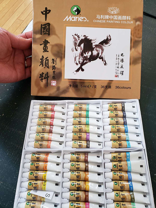
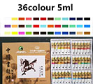
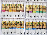
New packaging in none metal tubes!
Marie's is the oldest Chinese painting color brand since 1919 in Shanghai. This is a set of 12 colors in the new lead-free aluminum tube, which is good for your health. This product has satisfied the standard of European EN71-3 and American ASTM D-4236, also the ISO9002.
Twelve Colors 36 x 5 ML.
1. Chinese White ████ (104)
As kown as titanium white, an opaque mineral color. Often applied to the back of rice paper to enhance the whiteness of paper, such as waterfalls in landscape painting or the the white furs or feather on animals. Mix with carmine or rouge for paint pink flowers, mix with gamboge for stamens and pollen.
2. Gamboge ████ (218)
A transparent plant color. Good for flowers, mix with Indigo to make transparent green for leaves and trees. Mix with white to dot pollens.
3. Vermilion ████ (399)
A semi-opaque mineral color,good for painting orange red flowers, maple leaves and autumn foliage, or washing sunset sky, especially useful for painting rooster and gold fish. More intense but often mixed with cinnabar.
4. Cinnabar ████ (398)
A opaque Mineral color. Often used in flower and birds, and human figure painting. More chalky but often mixed with vermillion.
5. Rouge ████ (400)
A transparent plant color. A very rich dark red for flowers; diluted with water or white to make cool pink for plum blossoms, or add a red tinge to leaves or branches. A most commonly used color for painting the calyx of tree flowers such as plum, peach or cherry blossoms.
6. Carmine ████ (390)
A transparent plant color. A beautiful crimson for flowers. Often combined with white and rouge to paint peony, rose and other pink flowers.
7. Scarlet ████ (302)
A transparent plant color. Often mixed with vermilion and rouge for dark red peony or roses.
8. Umber ████ (684)
A semi-transparent mineral color. A brown color made from the yellow soil. Ideal for painting earthy landscapes, rocks, tree trunks and flower stems.
9. Light Green ████ (593)
An opaque mineral color. In traditional blue-and-green landscape painting, after a layer of transparent green is applied to the front side, this opaque green is applied to the backside of rice paper to create the final effect. Avoid using it alone on the front side of the paper. Always used on top of ink, umber or vegetable colors; otherwise, it will look chalky.
10. Light Blue ████ (493)
An opaque mineral color (azurite). There are three tones from dark to light and this is the third one(light). Used for thick leaves, rocks and sky. Use on the back of rice paper with transparent blue on the front to avoid chalkiness. Mix with Phthalocyanine to make it darker if needed.
11. Phthalocyanine Blue ████ (451)
A transparent plant color. Mix with gamboge yellow to make various greens in landscape and leaves. A more pure and intense blue than indigo.
12. Indigo ████ (495)
A transparent plant color. This is one of the most useful color in Chinese painting. Complementary to umber in traditional Chinese landscape painting. Mix with ink to make blue gray, and combine with gamboge to make green leaves.
13. Orange Yellow ████ (316)
A transparent plant color. Good for folow flowers, mix with Indigo to make transparent green for leaves and trees.
14. Peony Red ████ (393)
A transparent plant color. A natural red color that is lighter than rouge but darker than crimson lake. As its name suggests it is good for painting the red peonies.
15. Rose ████ (336)
A transparent plant color. Named after Chinese rose, I found this beautiful pink color is perfect for painting lotus flowers. Mix with rouge to make dark rose rose.
16. Dark Green ████ (591)
An opaque mineral color. There are three tones from dark to light and this is the first one on the dark side. If watered down and mixed with ink or other transparent greens it can be applied directly on the front side on paper for jade-green bamboo.
17. Raw Umber████ (601)
It is between yellow orche and umber.
18. Olive Green ████ (569)
A new transparent color. It looks nice when diluted with water. Mix with light ink to make very soft green grays. Tinge with red to paint tender leaves.
19. Dark Blue ████ (491)
An opaque mineral blue (Azutrite1). There are three tones from dark to light and this is the first one(dark). Used for with light blue on the back side of paper or directly on embed on the top of ink base.
20. Cobalt Blue ████ (453)
An opaque mineral color. It 's the second tone of the three mineral blue colors mentioned above.
21. Ultramarine Blue ████ (443)
A new transparent color. Very nice medium tone bright blue. Mix with brown for various light grays, or with ink for dark blue gray.
22. Purple ████ (439)
A transparent plant color. A ready made bright purple that is perfect for painting wisteria and other violet flowers.
23. Yellow Ochre ████ (676)
A new semi-opaque color. A brownish yellow or earth yellow. Used to mix with other color to make nice skin colors.
24. Vandyke Brown ████ (681)
A new Marie's mineral color. Red soil or terra rosa soil color.
25. Burt Siana ████ (687)
A new Marie's semi-transparent color. Use along as a rich dark brown color or mix with Ultramarine Blue for warm grays.
26. Row Siana ████ (688)
A new Marie's semi-transparent color. A nice yellowish brown.
27. Black 793
28. Burnt Tea ████ (699)
A semi-transparent mineral color. This greenish dark brown has got a very nice Chinese name Jiaocha or "burnt tea". A very useful color for both landscape and flower-and-birds paintings. It looks the best when diluted as a light brown on flower or tree leaves.
29. Jadeite Green ████ (511).
A new mineral green which is greener than regular mineral greens. Great to paint green leaves and trees, or to wash green lake or ocean. Allied alone or mixed with ink or other colors.
30. Peacock Blue ████ (448).
A new mineral blue color that is in between dark blue and dark green. As the name suggests this bright opaque color is used to add a peacock blue lust your ink painting strokes.
31. Lake Blue ████ (455)
An opaque mineral color. There are three levels from dark to light and this is the medium blue. As its name suggests that it is a lake-like blue color.
32. Medium Green████ (592)
33. Medium Blue ████ (492)
An opaque mineral color. There are three tones from dark to light and this is the second tone in between. If watered down and mixed with ink or other transparent greens it can be applied directly on the front side on paper for jade-green bamboo.
34. Yellow Green ████ (562)
A cool transparent yellow green color.
35. Naples Yellow ████ (210) OUT of Stock
A warm opaque yellow color.
36: Lemon Yellow ████ ((215)
A transparent cool yellow color.
FAQs
Q: What is the difference between the western watercolor and the Chinese painting color?
A: The difference is in the binding glue, source material and opacity.
Western watercolors are made to be used on watercolor paper which is none absorbent, and stretched before painting, whereas Chinese watercolor is suitable to paint on rice paper stretched after painting. If you use western watercolor on rice paper, the color will run and bleed when the painting is wet-mounted, but Chinese painting color is with more stable binder. Still if if you like to use heavy colors in your sumi or Chinese painting, I'd suggest you to use our silicone paper to dry-mount them.
Traditional Chinese watercolor is made from natural dyes and minerals rather than finer pigment particles in western watercolor. Please do not try to use Chinese painting color on regular watercolor paper especially the mineral colors because they are more opaque, not transparent. They are supposed to be used on the wrong side of rice paper.
Finally, I found western watercolor is very difficult to blend with sumi ink--they tend to be muddy or dirty when mixed and applied on rice paper. Chinese painting colors, on the other hand, are very friendly with sumi ink, which serves as the "bone" of Chinese painting. They could be mingled together to create all kinds of colorful gray tones often seen in Chinese paintings.


